Summary: Universal design promised that products and services were usable by everyone. But in practice, teams often translate “everyone” into an average user. That removes the very differences inclusion requires us to understand. A stronger approach is Microsoft’s principle: solve for one, extend to many. Start with people facing the sharpest exclusion. Design with them. Then extend the solution without losing the needs that shaped it.
Universal Design Doesn’t Work When “Everyone” Means the Average User
First, a disclaimer, this critique and course correction you are about to read, isn’t widely acknowledged by accessibility or inclusion specialists. That’s because the intent of Universal Design is worthy. Like the UN. But also ineffective, like the UN.
The problem with ‘designing for everyone’
“We’re designing this for everyone” sounds inclusive. Google’s inclusive design strategy is also detailed in a wonderful book titled “Building for Everyone” (Annie Jean-Baptiste). The aspiration is in the title. Yes, the wider goal is to build for everyone, but how you approach it should be the opposite. Note the book does justice on this but the title, meh. Here’s why this matters:
- Who exactly is everyone?
- Which bodies, minds, languages and situations are included?
- Whose needs disappear when they conflict with the majority?
Universal design is a valuable theory. Ronald L. Mace coined “Universal Design” in 1985. He was a disabled architect and educator at North Carolina State University. His focus began with buildings and products designed for broad use. Ben Shneiderman (who was Jakob Nielsen’s teacher) created the related term “Universal Usability.” He applied similar ambitions to computers and digital services.
Its original definition is careful: design products and environments for use by all people, to the greatest extent possible, without requiring adaptation or specialist design. Its seven principles include equitable use, flexibility and tolerance for error. The theory recognises human difference. It does not actually instruct designers to create for an average person. See The Center for Universal Design at NC State
I met Ben Shneiderman a few years ago (author of another wonderful book called “Human Centered AI”) and mentioned Universal Design was a failure and instead we need 3 Types of User Advocacy. He was very open to the idea and having Universal Design challenged. It’s time we follow Ben and think again.
At issue: Teams shorten “usable by all” into “one solution for all.” The well-meaning but excluding all the same effort starts in user research. Research gets spread across broad market segments. “User” becomes a customer segment and ‘edge cases’ are ignored as noise to business analysts or engineers. The final design reflects the largest cluster of needs. That is averaging. An average might be useful for describing a dataset. It is dangerous when treated as a person.
Why? Nobody has the average combination of vision, mobility, literacy, memory, attention, language, confidence, technology and context. A design optimised around that fictional midpoint may work adequately for many people. It may work exceptionally well for nobody. It can completely exclude those furthest from the centre.
That’s how: Designing for everybody can become designing for nobody.
Universal design can hide exclusion
Worse. the phrase “universal” creates confidence. It suggests the inclusion work is finished.
That confidence can prevent teams from asking harder questions:
- Who could not or did not participate in our research?
- Which needs did our averages conceal?
- Which access needs conflict with the ‘average user’?
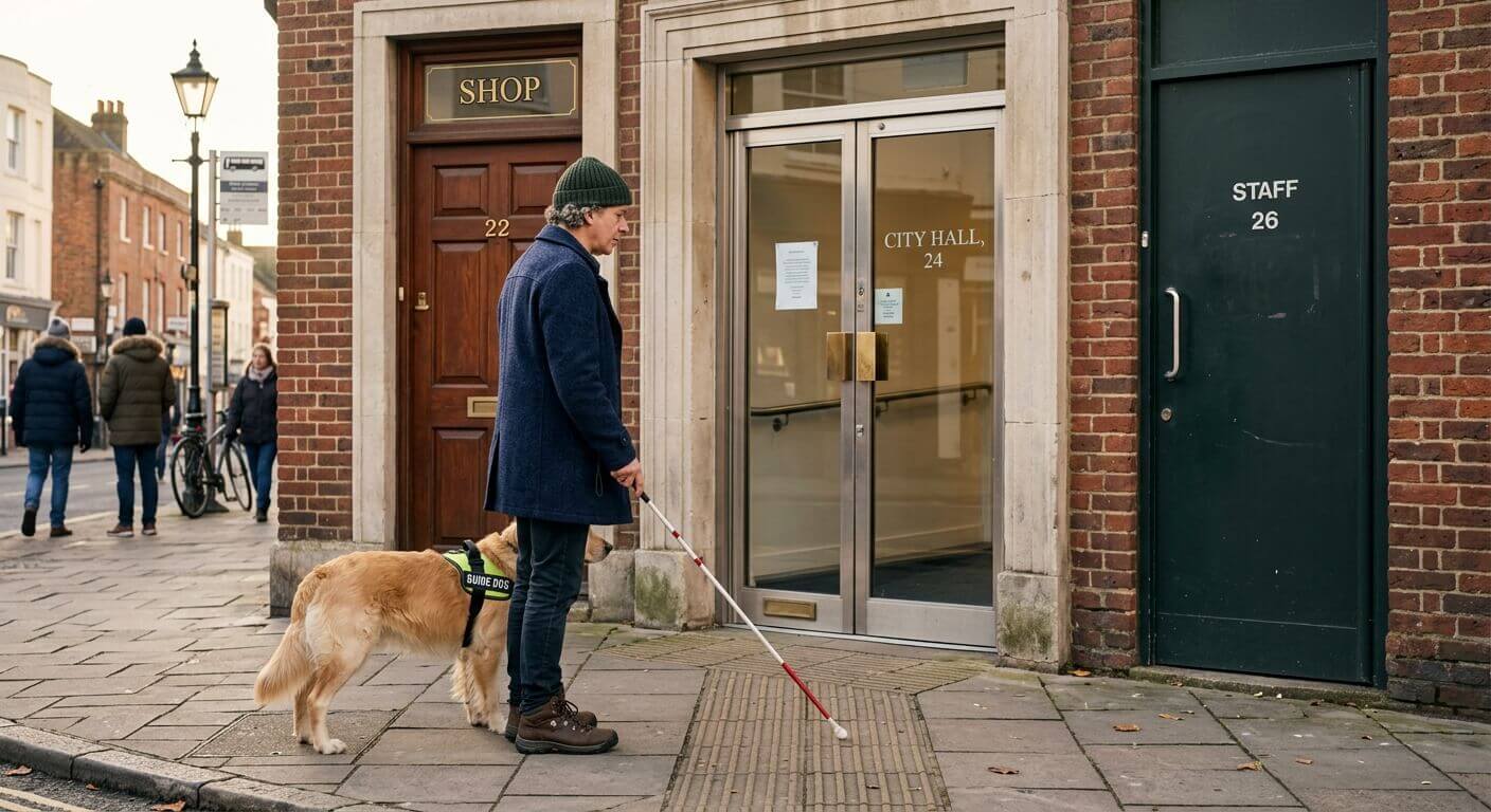
- Who must adapt themselves to our design?
- Who carries the cost when the design fails?
- Who abandoned the design or service before reaching us?
My take: How can you give feedback (customer satisfaction) if your broken journey left you unable or unwilling to give feedback?
Consider a service that reduces the length of instructional. The intent is to help people experiencing stress, fatigue or limited working memory. Yet removing detail may disadvantage someone who needs certainty, precise sequencing or clear consequences.
A quiet interface may reduce sensory load. It could also make important status changes too subtle. Voice control helps people with some mobility impairments. It can fail people with speech differences, strong accents or no private place to speak.
There is rarely one perfect expression of a service. The goal should be shared access, not enforced sameness. Sometimes equity requires equivalent routes, adjustable presentation or human support.
This is especially important in digital services. The W3C has warned that a one-size-fits-all accessibility strategy is inadequate for complex web experiences. Its guidance supports adaptation and personalisation because people need different terms, symbols and levels of support. See W3C personalisation roadmap and W3C guidance on adaptation
Solve for one, extend to many
Microsoft’s Inclusive Design methodology offers a more useful starting point: solve for one, extend to many.
Microsoft describes three connected principles:
- Recognise exclusion.
- Learn from diversity.
- Solve for one, extend to many.
The method begins with people who experience a severe or persistent mismatch. Their lived experience makes barriers easier to see. A solution shaped around that barrier may then help people experiencing similar constraints temporarily or situationally. See Microsoft Inclusive Design
Captions show how this works. They provide access for Deaf and hard-of-hearing people. They also help someone watching a video on a noisy train, learning a language or sitting beside a sleeping child. The wider benefit matters. But the original access need matters more.
Captions were not discovered by asking an average viewer whether sound was convenient. They respond to a specific exclusion. Their wider usefulness follows from solving that exclusion well.
This reverses the usual logic. Teams stop beginning with the centre and making late adjustments. They begin at an edge, where the design is under the greatest pressure. That pressure exposes assumptions hidden inside the service.
“One” does not mean one convenient participant
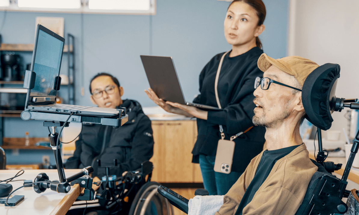
Let’s clarify this a bit: “Solve for one” can be easily misunderstood. It does not mean taking one person’s preference as a universal requirement. Nor is it about choosing an inspiring story and turning it into a persona. And worst of all (this is endemic in accessibility work) does it mean using disability as an innovation exercise while excluding disabled people from decisions.
“One” means focusing on a clear access barrier or exclusion, grounded in lived experience. Design for that access need first. Build it in. Then extend the solution without weakening it. e.g. A ramp may begin with wheelchair access. Once effective, it can also support prams, bikes and luggage.
How: Start with a target community. Within that community, study variation. A label never gives you a complete need. Two blind people may use different technology. Two autistic people may have opposing sensory needs. People also experience disability alongside race, gender, age, class, language and culture. Understand your edge cases or exclusion cases with an intersectional lens.
This is why proximity (getting close to your users as a cultural must) matters. Designers must work directly with the people affected. The W3C’s cognitive accessibility guidance recommends including people with cognitive and learning disabilities throughout user needs, design patterns and usability research. Automated checks alone cannot establish whether somebody can use a service. See W3C cognitive accessibility guidance
How to design for one, then extend to many
1. Name the exclusion
- Begin with a barrier, not a demographic.
- Avoid “design for older users.” Ask: “How might someone complete this application when their vision fluctuates and enlargement hides surrounding context?”
- Describe the task, environment, consequence and current workaround. This makes the design problem observable.
2. Go to the target community
- Recruit people who live with the exclusion. Include community organisations, advocates and specialist practitioners (subject matter experts) where useful.
- Pay people for their expertise. Make participation accessible. Offer different ways to contribute. Avoid asking one person to represent an entire community.
- Research should include people whose experiences challenge the proposed solution.
3. Find variation within the edge
- Do not generalize the evidence too early.
- Map differences in ability, technology, environment, confidence and support. First capture permanent disabilities and then extend to temporary and situational constraints. Look for conflicting needs and points where people create their own adaptations.
- Look for workarounds and abandonment. Look for reliance on family, staff or unofficial channels.
4. Co-design around the hardest moments
- Invite people into framing and making decisions. Do more than test a nearly finished interface.
- Focus on the moments carrying the greatest risk or effort. These might include proving identity, understanding consequences, recovering from an error or asking for help.
- Create several routes where needs conflict. Make sure proposed solutions are compatibility with assistive technology.
5. Build flexibility into the core
- Do not bolt accessibility onto a fixed journey.
- Build in options such as adjustable presentation, multiple input methods, saved progress, clear recovery, additional explanation and supported completion. Preserve compatibility with assistive technology.
- The user should control meaningful choices. A system that guesses somebody’s needs can reproduce the exclusion it claims to solve.
6. Validate with the original community
- Return to the people who exposed the barrier.
- Can they complete the journey? At what cost? Do they understand the outcome? Can they recover without outside help? Does the solution create a new burden elsewhere?
- Use WCAG compliance as a baseline. Successful use is the real evidence.
7. Extend deliberately
- Now examine adjacent populations and situations.
- A solution supporting permanent motor impairment may also help someone with an injury, a parent holding a child or a worker wearing gloves. A clearer decision trail for people with memory differences may help anybody returning after an interruption.
- Test these extensions. Do not merely claim a universal benefit.
8. Protect the need during scale
- Scaling often strips away the details that created inclusion.
- Record the original access need as a product requirement. Link it to evidence. Give someone authority to protect it during prioritisation. Monitor completion, failure and support demand by relevant access needs, with appropriate privacy safeguards.
- When budgets tighten, the original community should not lose the solution first.
Inclusion is a direction, not a finish line
Universal design gives us a valuable ambition. But the problems begin when universality becomes uniformity. Human difference cannot be averaged away. Nor can every need be resolved through one standard interface. Inclusive systems must allow variation, adaptation and equivalent routes.
Microsoft’s “Design for one, extend to many” offers a better design approach. It makes disability-first solutions be baked in before they scale. It treats lived experience as expertise. It puts exclusion at the start of design, where it can shape the service architecture.
So we need to stop asking: How do we make one design work for everyone?
And instead ask: Who is most excluded, what can they teach us, and how can we extend that learning without erasing them?
That is how inclusion gets baked into the design, and how accessibility meets it’s goals without falling into flat aspirations.
—
Learn opportunity: This all starts with User Research– learn how to do Inclusive User Research (starts in October)
Also check out this FREE session: How to Advocate for Disabled Users